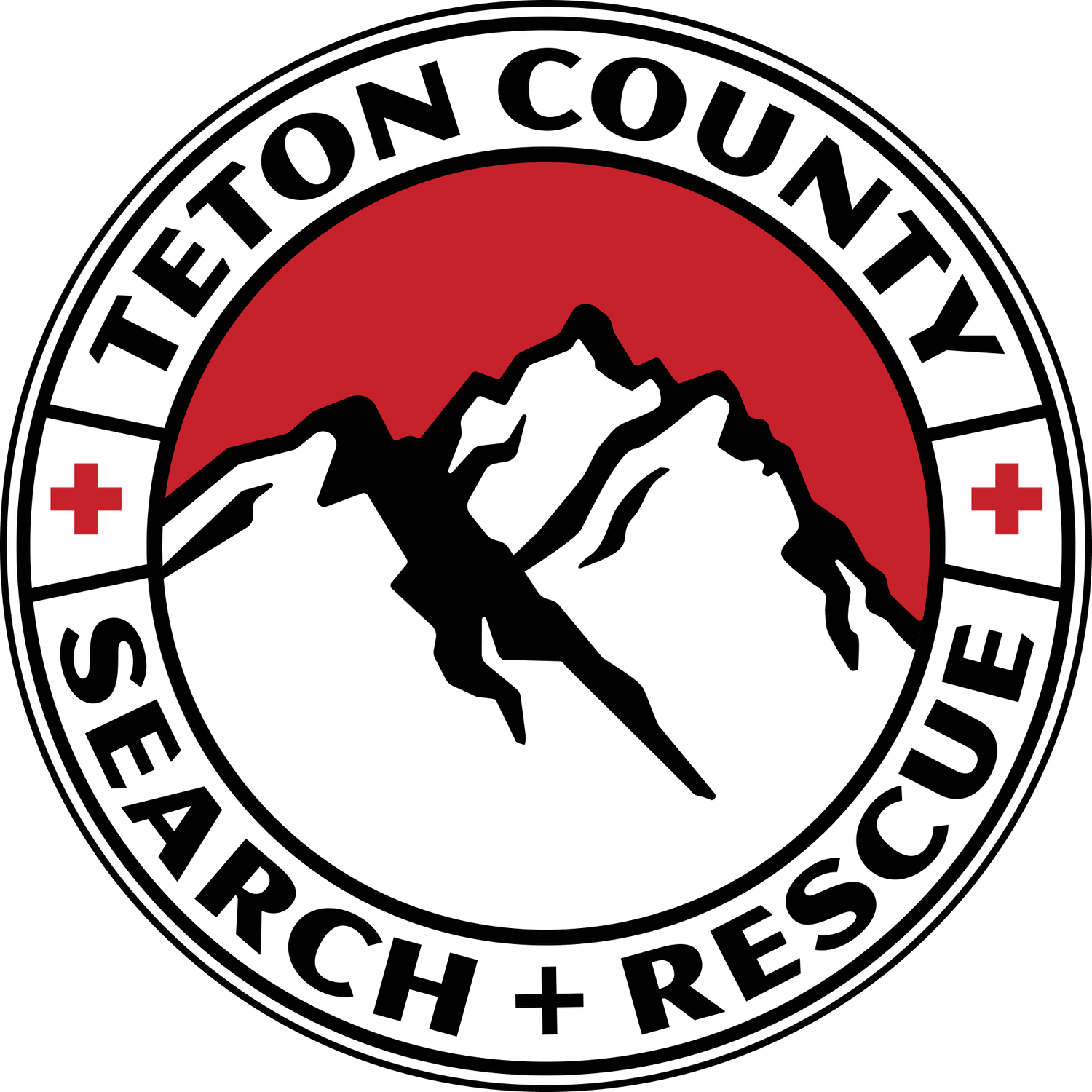
Jackson, Wyo. — Since it was founded in 1993, Teton County Search & Rescue has seen many changes. Technology, gear and equipment now allow the recreating public to go faster and farther into the backcountry, placing new demands on rescuers. As of this summer, another change includes the team’s logo, the third such iteration in TCSAR’s 30-year history. The new logo is intended to be clean, modest and instantly recognizable, with the silhouette of the Tetons as the anchor. A red sky represents “Rescue Ready,” and helps tie in the colors and heritage of the previous logo that represented the team for three decades.
A specific skill or rescue profile was avoided on the new logo due to the many different ways the team responds. While TCSAR has become known for its helicopter operations, that alone would ignore all other rescue skills the team possesses.
Encompassing all of what TCSAR does and has accomplished after 30 years is a difficult task, but ultimately, the Tetons remain the bedrock for the team and its unbreakable connection to the community. TMBR, a Jackson-based creative agency, designed the logo in coordination with a small group of TCSAR volunteers and TCSAR Foundation staff. The final version was presented to the team, which gave its approval.
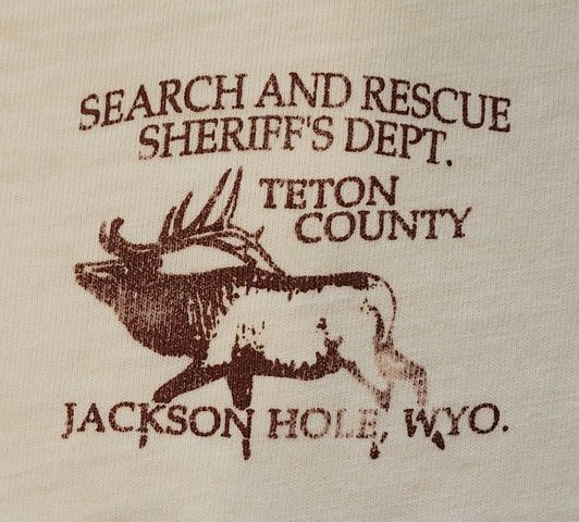
TCSAR’s first logo was brought on by Alan Merrell, who started the team in 1993 at the direction of Roger Millward, the Teton County Sheriff at the time. That first logo included a bugling elk. The elk continues to be on the logo representing the Teton County Sheriff’s Office. The SAR elk lasted only a short while before local artist and TCSAR member Diane Benefiel designed what many consider to be the original TCSAR logo.
Volunteers with TCSAR’s founding class gather for a party in 1994. Alan Merrell is front middle, holding the cake. Diane Benefiel, the artist for TCSAR’s first official logo, is to his left. Photo: TCSAR archive
Benefiel, a graphic designer and artist who worked at the Jackson Hole News from the late 1970s until 2000, became a TCSAR volunteer in 1993 along with her husband, Keith. Soon enough, Alan asked Diane to design a new team logo. One of her original designs included a compass with the Indian Paintbrush, Wyoming’s state flower. (Similar themes were considered during the new logo design process.) Alan was not convinced, and asked her to go back to the drawing board and include a climbing rope with a double fisherman’s knot, and an image of a high-angle rescuer in the Tetons.
“The reason he wanted a high-angle rescuer was he felt it was indicative of the difficulty and high level of skill the team could perform,” Diane said. “He knew that if we as a team could master high-angle rescue, we could do any rescue.”
As Diane recalls, Alan also believed that by dedicating training to high-angle rescues, everyone on the team would have a job, which would help the young team build structure, trust and unity.
“When it came to the knot,” she said, “they knew that a correctly tied knot would save someone’s life, and that symbolized the trust everyone had for each other.”
As a rescuer, Diane knew the knots and how to draw them.
“I’ve always liked bright colors,” she said. “The ropes are bright colors for obvious reasons, and the black was just for contrast. I liked the circle because I liked round patches. In the end, Alan liked it, too, and the team adopted it.”
Ever since, Diane’s illustration has represented TCSAR on all team-issue gear and apparel, mission equipment, stickers and letterhead, social media, snowmobiles, UTV’s, trucks, and a helicopter. The patch even made a pilgrimage to space aboard the International Space Station.
NASA Astronaut Andrew Morgan snapped this photo of the TCSAR patch while aboard the International Space Station at the end of 2019.
Diane appreciates and understands why the team would want a new logo after 30 years. “It’s a new team, it’s a new look,” she said. “People forget the old, but if you keep a record of it in the hangar, people will be able to remember it and feel the nostalgia.”


